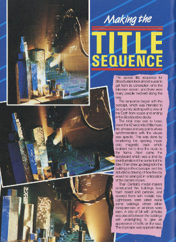
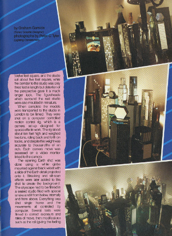
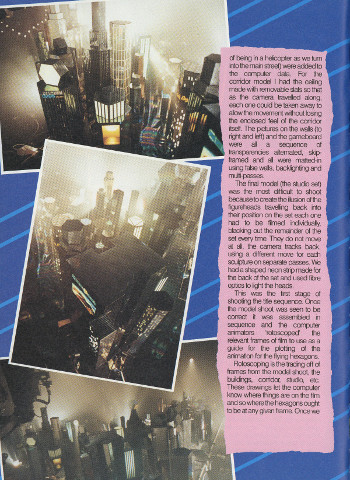
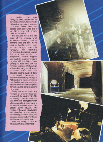
One of my most vivid television memories as a child was the title sequence to Blockbusters.1 Every afternoon I’d lie in front of the fire, and that gorgeous neon cityscape would transport me to another world.
I often wondered how it was made… and the answer came when I ended up in hospital, and I managed to borrow a copy of the 1989 Blockbusters Annual. Contained within was a four page feature on how the titles were made. I devoured it… and then had to give the annual back at the end of my stay when I had the temerity to get better. I never managed to trace down a copy over the years, and in the end those pages became a distant memory.
Nowadays, I’m an adult, and eBay is a thing. And this morning, I finally saw that feature I hadn’t seen for over twenty years. If anything, it’s even more detailed than I remember, with many absolutely gorgeous behind-the-scenes photos… and well worth sharing with you lot.
It is perhaps tempting to use the above as a stick to beat modern-day television. “Cuh, you can’t imagine an afternoon quiz show attempting anything like the above these days, could you?” And that’s absolutely true… except it’s worth remembering that the above was unusual for the time, too. Few afternoon quiz shows decided to get out the old motion control rig and shoot one of the best title sequences in the history of television.
Still, we’re often told that we’re in a golden age of TV. And seemingly endless afternoon quizzes are made – Pointless is nearly at 1000 episodes, with over 200 ordered this year alone. True, a title sequence like the above would be expensive – but spread over the cost of so many episodes, the cost surely wouldn’t be prohibitive. Nor would it need to be as long either, if you’re worried about such things.
Wouldn’t it be lovely if a current quiz show decided to throw caution to the winds, and try making a truly ambitious title sequence again? One that gives a show a real sense of, for want of a better word, showmanship?
Technically, the second title sequence – the first is nice enough, but nowhere near as good as the famous one. ↩


7 comments
Stuart on 7 September 2016 @ 3pm
Years ago I visited the Central studios in Nottingham, and I’m pretty sure they had the carved sculptures from the walls of the Blockbusters studio hanging up in the reception/stairwell. Wonder what happened to them.
Neil on 9 October 2016 @ 11am
This article is awesome – thanks for sharing the scans!
(Always wondered if it was a model, and if so how did it get through the gaps!
You inspired me to consider my future in the bleak dystopian Bob Holness cityscape, and link back to you here – hope that’s okay.
https://neilmossey.blogspot.com/2016/10/how-they-made-blockbusters-opening.html
Duncan Newmarch on 21 January 2017 @ 11pm
The titles are amazing (please don’t show us any of those dopey students attempting to dance over the closing theme) but the mix from that Central ident is one of the best things you’ll see on television
Duncan Newmarch on 21 January 2017 @ 11pm
Oh no, I’ve just watched the end credits and they should be ashamed of themselves…even today. No, it’s not clever… or funny. Now switch over to BBC1
Ade Jacobs on 29 August 2023 @ 9pm
Those titles are just so well made. I’ve seen recreations of this on You Tube and they totally lack the charm of the original. Lovely article too.
PS: I agree with Duncan Newmarch about the silly routine over the end credits. it’s so embarrassing
Matt A on 29 August 2023 @ 11pm
I once worked with someone who had been an apprentice at Central. He told me how the Blockbusters playboard worked. In an all too brief conversation, he gave me a behind-the-scenes glimpse of something as impressive and wonderful as the making of the title sequence seems to have been.
Apparently the board, which appeared on TV to be a computerised matrix of flashing digital letters (often superimposed on the contestants’ desk), was actually a surprisingly large and nightmarishly complex array of Kodak slide projectors. These were mounted side by side and one above the other, each one back-projecting an image of an individual letter onto its own corresponding segment of the board.
The contestants – and TV cameras – of course viewed the board from the front in the studio.
My colleague told me each projector was loaded with a sequence of slides that would provide the letters for the consecutive games in a show. Organising the board and loading the slides was apparently a mind bogglingly tricky task. And the technical operation of all the flashing projectors and coloured lights that replaced a “played” segment was a feat of hard-wired engineering brilliance . I wish i could have found out more but it’s something I’d love to have seen.
Matt A on 30 August 2023 @ 12am
Just seen that the slide projector thing is mentioned in your other post from the Blockbusters annual! Wow, so interesting!