Alternate Cover - 27th March 2006
Better late than never, they say, which is lucky because due to illness I've slipped a day even after I put it off for one to go to Memorabilia. At this rate you won't be getting June's reviews until August. Luckily, it's a slow week for the next column so I might just get it all in on time. While you're taking bets, there's plenty to consider here as I take a gander at Supermarket #2, Daredevil #83, Incredible Hulk #93, New Avengers #17 and X-Men #184.
 |
Supermarket #2 (of 4)
Publisher IDW • Writer Brian Wood • Artist Kristian Donaldson
And so to begin, it's once again that time of the week - the "Recommend a Brian Wood comic" section of the reviews. Supermarket #2 is this week's Wood release, set in an inspecific future time where corporations control everything. This is one of Wood's action comics, there's no doubt about it. His work tends to fall close to one of two categories - the more introspective material on Demo and Local, and the gunfights and car chases of Couriers and Supermarket, so it's good to know what you're getting. Personally, I like 'em both.
Following the events of last issue, main character Pella is on the run from the mob with no idea why. This issue, she learns why. She's the daughter of the twisted Rome and Juliet-style union of a member of the Yakuza, and a Swedish Porn Star. Her parents left their lives behind to protect her, but it's caught up with them, and now they're helping Pella from beyond the grave with their network of contingency plans designed to keep her one step of their enemies. Pella deals with the revelations in the most typical way possible - by getting into a firefight with the Yakuza which only ends when the porn stars show up. The big mystery is why Pella is so important to the two "families" - Money? Honour? Revenge? Or something else? I can't wait for the rest of this series, that's for sure.
Kristian's art is easily on par with the writing. Easily some of the best I've ever seen on a Wood comic (not to put down his other collaborators.) Her stylised palette and wonderfully sketchy pencils create a unique tone. I get the feeling Wood is writing silent sequences just so we get to see what she can do. This comic also has one of the finest quality packages I've ever seen, with paper stock thicker than I've ever seen. Each issue is almost twice the thickness of a normal comic, and the texture of it just clings to the art. The only downside is that it pushes the price up to $4, but when you're getting work of this quality, that's practically peanuts. Do I even need to grade this? A+.
 |
Daredevil #83
Publisher Marvel • Writer Ed Brubaker • Artists Michael Lark & Stefano Gaudiano
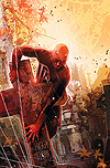
Brubaker and Lark's second issue of Daredevil continues to prove that they can fill the shoes of Bendis and Maleev without any problems at all. Lark's art is sufficiently moody and Brubaker's writing builds on what Bendis did with the character, turning him into a powerfully driven man, whose identity as Daredevil is on the fringes of urban legend. During Bendis' run Matt occasionally let himself go too far and reveal his identity (during what was later established as a period of mental breakdown) but he always had something holding him back. Now, with his freedom taken and his best friend dead, with the justice system failing him at every turn, Brubaker shows just how far Matt's going to be willing to go, and it's not a good time to be on his bad side.
While I'm unsure about having Foggy killed, I can't deny it's making for great stories. Foggy wasn't a character I cared about at all until I started reading Daredevil, and while he was well-used in Kevin Smith's run, Bendis hasn't used him so much. It's always a shame, then, when a writer decides the best use of a character is to kill them off, especially someone who's been very integral to the Daredevil mythos over the years. Maybe the belief was that he doesn't fit in well with the current noir-ish tone of the book. Either way, if they're going to actually kill him, I hope that it sticks and that they get a lot of good material out of it, because there's a lot of justification needs to be done after a change like this.
The other half of the plot concerns the appearance of a second Daredevil filling the shoes (or rather, tights) of Matt Murdock, with little clue to his identity so far - a classic comicbook "Who's behind the mask?" story and one that I'm a total sucker for. My head is already spinning with guesses. Ben Urich and Dakota North ("who?") are on the case, though, and just as Bendis is seemingly obsessed with bringing back ailing 70s characters, I can't help wonder if Brubaker's going to be working the 80s. Obscure character revivals aside, you can't fault the new guys. A.
 |
Incredible Hulk #93
Publisher Marvel • Writer Greg Pak • Pencils Carlos Paguluyan • Inks Jeffrey Huet
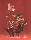
If anything, Hulk #93, the second half Planet Hulk, is even more Conan-esque than the previous issue, not least because in a fit of anti-decompression we get what appears to be weeks of story in a single issue, as the Hulk is placed in a team of gladiators and made to fight for his life. It's epic fantasy detailing the Hulk's rise to prominence as a slave that's defying the empire with his very continued survival, and it's an absolute joy to see that where Pak could've written 4 or 5 issues of increasingly tedious fight scenes, he's just raced through it and got to the next meaty part of the story, as the Hulk's team is broken out by insurrectionists and asked to help fight the government.
Pak's writing on Planet Hulk is surprisingly tight. He struggles a little with some of the alien dialogue sounding a little forced ("Lord I am your rockling") but his plot appears to be proceeding well. The choice of a brood worker as part of the cast is an interesting one that will likely amount to something in the long run (I'm sure we can't trust everyone). At the moment, the main problem with the writing is that it's feeling a little predictable - hopefully there's a twist planned along the way.
Pagulayan's art continues to have a great sense of energy and he's doing well with the incredibly crowded nature of the storyline. He draws a Hulk that can't be faulted, even though they've gone the debatable route of giving him armour and an axe - a look that's never really worked before - though at least in this case I actually believe he needs them. Definitely looking forward to more. B+.
 |
New Avengers #17
Publisher Marvel • Writer Brian Bendis • Pencils Mike Deodato • Inks Joe Pimentel
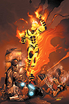
After last week's disappointingly Avenger-less issue, Bendis and Deodato scramble the troops to confront whatever threat it is that appears to have emerged out of the House of M event. He says his name is Michael. The best scene in the book, though, occurs right at the start with Luke Cage roping in the Avengers to do some of the community-superheroing that gives the character a unique inspired turn.
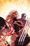
As the Avengers move towards the threat, they attempt to rope in various supporting cast members in order to lend some weight to the situation (because, let's face it, killing off Alpha Flight isn't really establishing you as A-List.) - The Sentry seems unavailable, but Ms Marvel turns up just in time to screw up their efforts to resolve things without a fight. Of course, between the use of Ms. Marvel, The Sentry, and Spider-Man's new costume, it feels just a little too much like you need to be reading everyone's books to get the full story. It's all contained in here, more or less, but the danger of spinning out (and spinning in) a lot of characters from the series is that it can start to feel like you're only seeing part of a tapestry. Luke Cage is currently the only character in this series without an ongoing or mini.
It's only a small concern, though. Bendis can barely put a foot wrong on this title. Deodato is less of a sure thing, but as I've probably mentioned before, seeing the reinvention he's undertaken in his style is nothing less than astonishing. Even when drawing Carol, he manages to rein in the cheesecake elements that previously typified him. His art relies on heavy shadows and from what I've seen, looks best in black and white, but he's doing well enough. A.
 |
X-Men #184
Publisher Marvel • Writer Pete Milligan • Pencils Salvador Larocca
Like much of his X-Men run, the best parts of this issue are mainly down to Milligan's incredibly weird sense of humour. He clearly finds the sheer concept of Apocalypse laughable, and because of that, he is being written with a hilarious attitude that also manages to be a great take on the character - a megalomaniac who is slightly unsure of himself, but pressing ahead because he's not sure what else he's to do. At least there's a nod to the logic of this, where Cyclops references their shared-body experience as if to remind us that maybe Apocalypse isn't entirely himself. By contrast, the characterisation of Gambit takes a severe downturn as his reasons for becoming a horseman are decidedly...illogical. Making a deal with the devil (Sinister) was a defining event in the history of the character, but it's hard to believe that he'd make such an obvious mistake again.
I'm not a big fan of turning such established characters into Apocalypse's horsemen. Compared to the days when the concept was first introduced, recent horsemen have all fallen a little flat, and it's not clear why Apocalypse goes to the trouble. With Gambit, we're now seeing 4 X-Men who have been horsemen (Gambit, Sunfire, Wolverine, and Angel) - add to this previously established characters, Deathbird, the Hulk and Sabretooth, and then consider the ramifications this has had on any of them - besides Angel, whose personality was altered and whose changes stuck for years, the alterations have been otherwise superficial for everyone else and it kills the shock that you'd hope to get from transforming someone like Gambit.
The whole storyline, unfortunately, feels a little under-plotted. I've not been much of a fan of Larocca's artwork for quite some time now, so I'm glad to learn that there's a creative reshuffle coming. Milligan's run has been far below his potential as a writer and this story just highlights every reason why that is. It's good, but it should be much better. C+-
About this entry
- By James Hunt
- Posted on Monday, March 27 2006 @ 4:15 pm
- Categorised in Comics
- 0 comments
